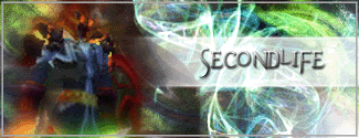
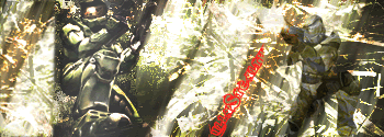
First the the dude on left to fuzzy rar.
Third one I immediately go eww bad render job, pixelated pewpew.
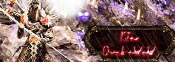
Fourth sephiroth just seems to be part of the background nothings really being brought to attention to make me go OOO.
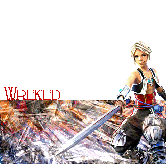
Fifth I cant read what the sign says.

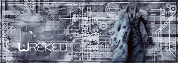
Sixth Bad positioning of the render and it doesn't really stick out either.
Seventh my attention was dragged to the area between the txt and the girl, did you really want me looking ter. o.0
Eighth Looks nice.