
Requesting advice.
-
Syre
- Forum Staff
- Posts: 506
- Joined: November 17th, 2008, 3:49 pm
Requesting advice.
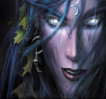
Alright..so im not really good at photoshop..tried it just a few times. And i wanted to try to create a new sig, however, i know it needs to be improved, i just not sure exactly what and how, so i'd like to hear anyones opinion to help me out a bit. Heres what i got so far...thanks ahead of time for any advice ;D
-
Small Sized Duck

- Noob
- Posts: 946
- Joined: December 23rd, 2008, 11:27 pm
- Title: LSD.
- Location: Your Girlfriend's Pants.
Re: Requesting advice.
You should add a fog effect, that would make it look awesome.
Filter > Render > Clouds.
Blending options > Remove all Black
Use a black brush to get rid of the parts you don't like.
Filter > Render > Clouds.
Blending options > Remove all Black
Use a black brush to get rid of the parts you don't like.
-
Syre
- Forum Staff
- Posts: 506
- Joined: November 17th, 2008, 3:49 pm
Re: Requesting advice.
Thanks, it lightend it up quite a bit. Heres how it looks now..since the fog made the text, really stand out, i turned it down some, probably a bit too much, but thats an easy fix. Btw, what do you think about the text? Does it fit alright with the image? I had a hard time finding one that i liked..lol

-
Slickslime
- Forum Staff
- Posts: 543
- Joined: October 7th, 2008, 5:41 am
Re: Requesting advice.
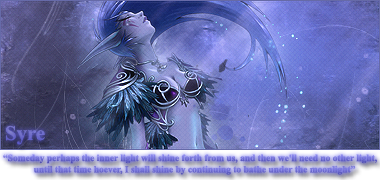
well, i can't really see you're name...especially the Y
Try make it stand out more
Try make it stand out more
-
Small Sized Duck
- Noob
- Posts: 946
- Joined: December 23rd, 2008, 11:27 pm
- Title: LSD.
- Location: Your Girlfriend's Pants.
Re: Requesting advice.
ahh. The text looks like SPRE. Lol. Maybe try making the text a tad bit darker?
That's a pretty good sig, even though it's not my style :].
Im into motion blurs and grunges.
That's a pretty good sig, even though it's not my style :].
Im into motion blurs and grunges.
-
Syre
- Forum Staff
- Posts: 506
- Joined: November 17th, 2008, 3:49 pm
Re: Requesting advice.
Thanks, i knew that the y was messed up, just dident mind it much. I found a similar font so i just changed it, and brightend it up a bit. How's it now?

-
Small Sized Duck
- Noob
- Posts: 946
- Joined: December 23rd, 2008, 11:27 pm
- Title: LSD.
- Location: Your Girlfriend's Pants.
Re: Requesting advice.
I say darken the uhm thing on the left but leave the background as is or vice versa
-
Syre
- Forum Staff
- Posts: 506
- Joined: November 17th, 2008, 3:49 pm
Re: Requesting advice.
Done darkening it..never darkened just a section like that before so hope i got it right...lol i have to make a matching avatar too later..>.<..

-
Small Sized Duck
- Noob
- Posts: 946
- Joined: December 23rd, 2008, 11:27 pm
- Title: LSD.
- Location: Your Girlfriend's Pants.
Re: Requesting advice.
That looks awesome.
I love how the wings are darker and how the dark areas give it a shadow affect.
I love how the wings are darker and how the dark areas give it a shadow affect.
-
thenebrae
- Newcomer
- Posts: 22
- Joined: May 3rd, 2009, 2:58 pm
Re: Requesting advice.
u can spread more the width and blend the render...
that render fit realy good in that background , and i like :3, in some case the render fits better in the center but that render is okay in this place...
u are very good and the shadow effect rulez , u gonna be very good in Photoshop...
that render fit realy good in that background , and i like :3, in some case the render fits better in the center but that render is okay in this place...
u are very good and the shadow effect rulez

Spoiler:

