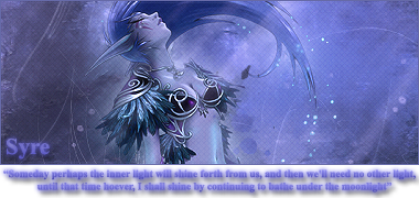
My newest sig
-
Syre
- Forum Staff
- Posts: 506
- Joined: November 17th, 2008, 3:49 pm
My newest sig
Well..had some free time so i created a new signature...tell me what ya think or how i can improve it. Im really bad at thinking up text, and having just my my name looks a bit..well, empty..So i thought i'd try this out and added an edited quote that fit the image, below the the picture itself...i think it turned out alright, however its my first attempt at trying anything like it..so im not completely sure about it...
-
UndeadxAssassin

- Grammar King
- Posts: 2120
- Joined: June 22nd, 2008, 10:11 pm
- Title: Worst human for 4eva
- Location: Mostly USEast
Re: My newest sig
The picture looks nice. I like it, although the top right side is a bit too empty for my tastes. The quote is a bit hard to read, too. Maybe use a darker shade of purple? It's probably just the wc3edit background.
(20:53:52) Bartimaeus: Thank you, Jen.
(20:53:56) Bartimaeus: Truly, you are wise.
Learn how to extract and read RAW Codes here!(23:44:12) Bartimaeus: I was in pubic school until middle school...
Need help? Click here and ask your question!
-
Lanaya

- Banned-To-Be
- Posts: 1378
- Joined: July 28th, 2008, 6:28 pm
- Title: Administrator
Re: My newest sig
Awesome sig syre, i use to have a Tyrande Whisperwind avator XD
League of legends North America - Nietono
-
Syre
- Forum Staff
- Posts: 506
- Joined: November 17th, 2008, 3:49 pm
Re: My newest sig
Thanks for the advice. I thought that side needed something, however i couldent think of what. I tried out some of the lines that are over the sides of the picture, but it seemed to overpower the entire sig, the same for any kind of sparkle.UndeadxAssassin wrote:The picture looks nice. I like it, although the top right side is a bit too empty for my tastes. The quote is a bit hard to read, too. Maybe use a darker shade of purple? It's probably just the wc3edit background.
For the text, i chose a darker color on purpose, i didn't intend for the lines to stand out that much so it'd be read each time the sig is looked over. I wanted it to be more part of the background than anything..basicly it gives the sig some added flavor, while not standing out much but still being able to be read if wanted.
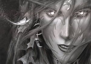
;D Thanks for the compliment. I think that this is probably the sig that i worked on most. For the avatar i had two choices, the color one, or a black and white one i found..both would work, but i first had leaned towards the B&W one since it had a bit more there, but in the end chose the color..Lanaya wrote:Awesome sig syre, i use to have a Tyrande Whisperwind avator XD
Spoiler: